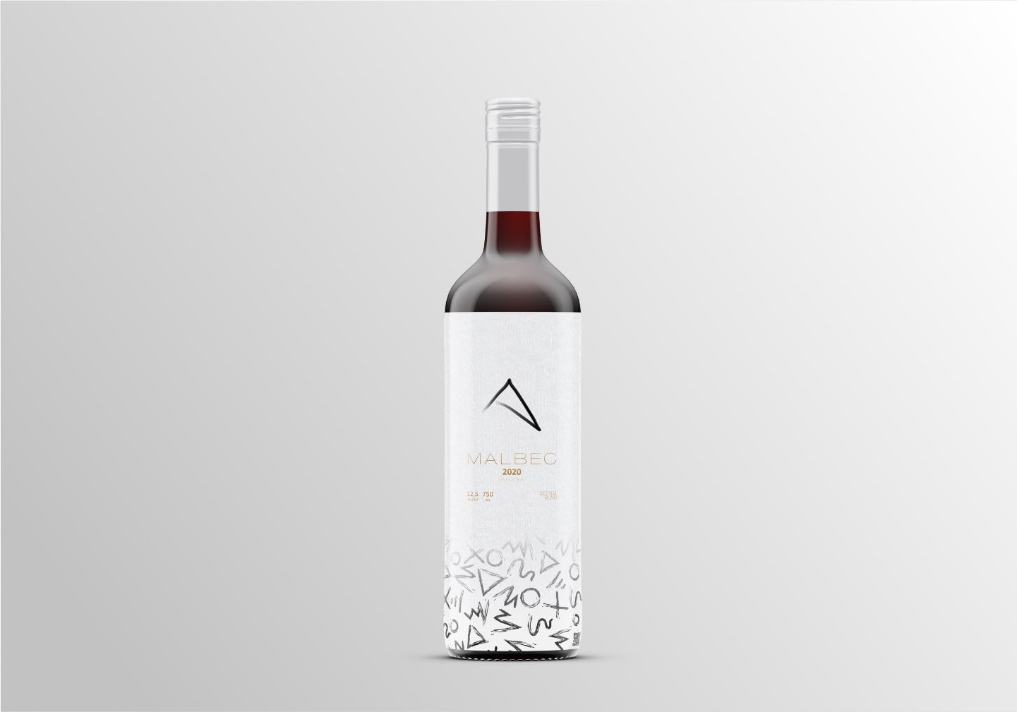

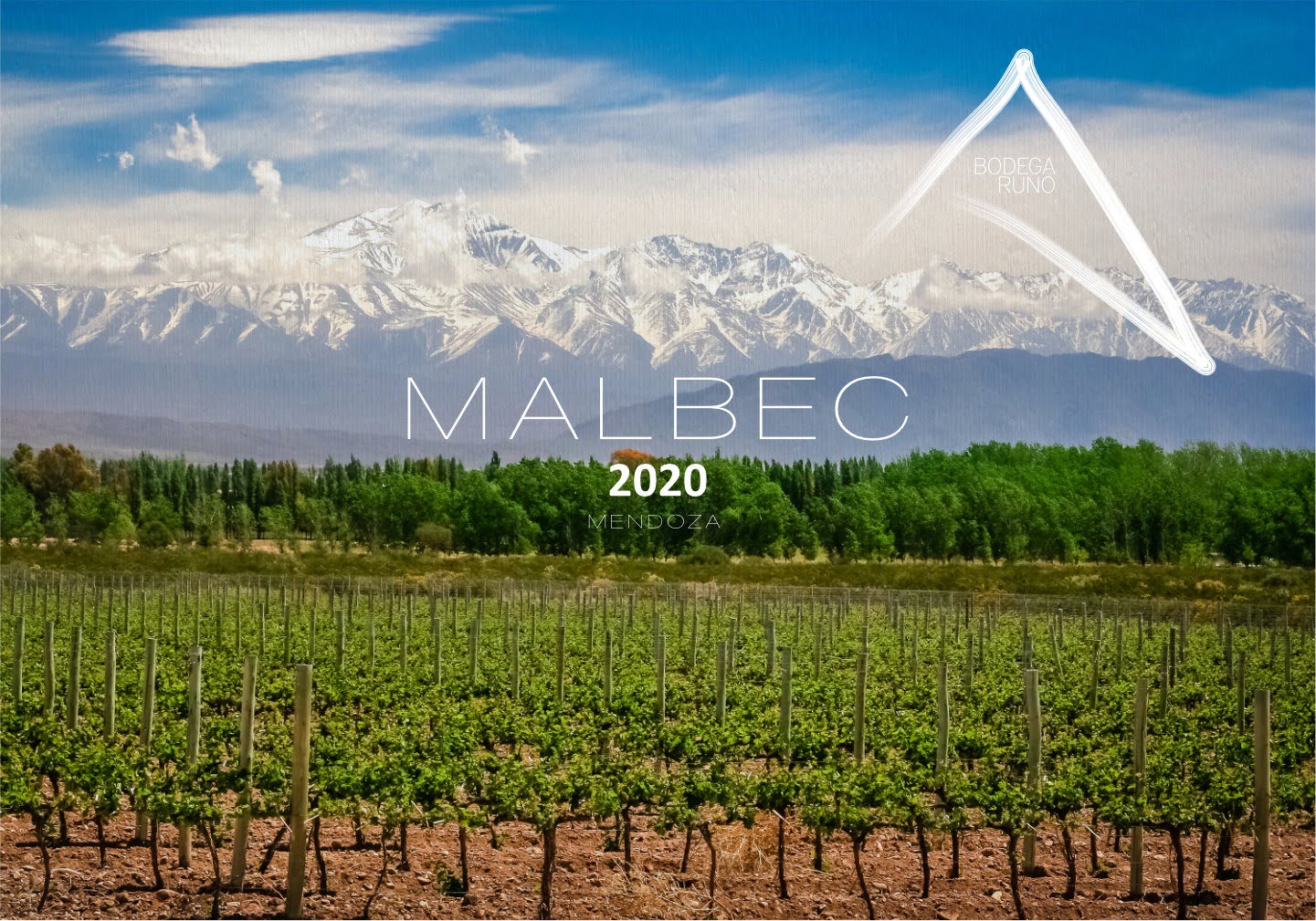
Bodega Runo
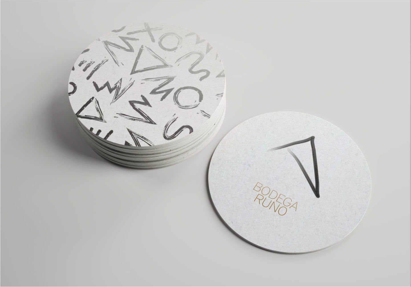
Bodega Runo is a concept design that embraces the location of its vineyards. Hugging the Andes chain, we decided to incorporate this fact into the logo itself. By using a hand drawn shape to illustrate this connection to the mountains, it becomes immediately clear of its origin and location.
Our special edition Malbec wine label plays with the shape concept in a very fun and creative manner. It has an unusual white background that symbolises the snow capped mountains that are visible from the vineyards several months of the year.
ClientBodega RunoCountryArgentinaServicesBranding, Packaging