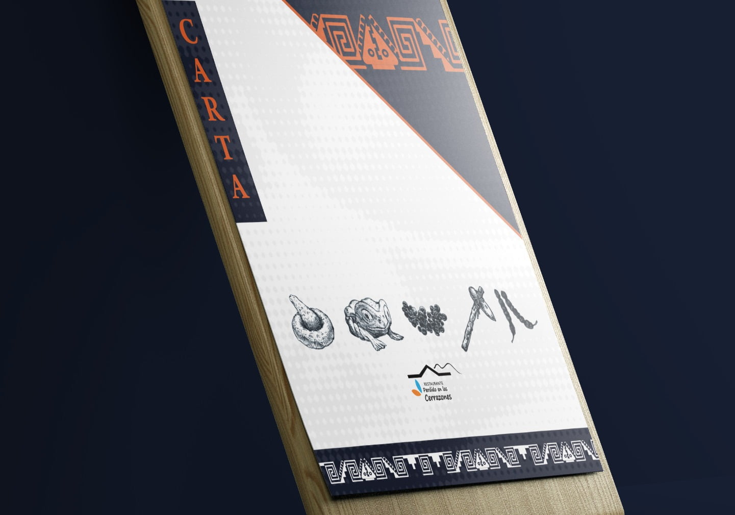
Perdido en las Cerrazones
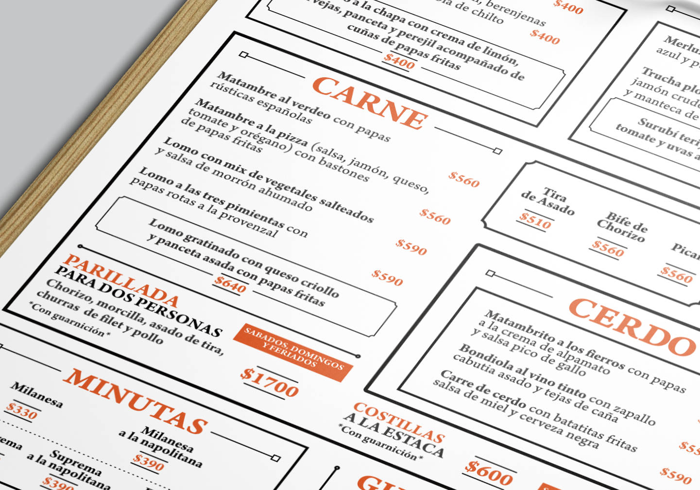
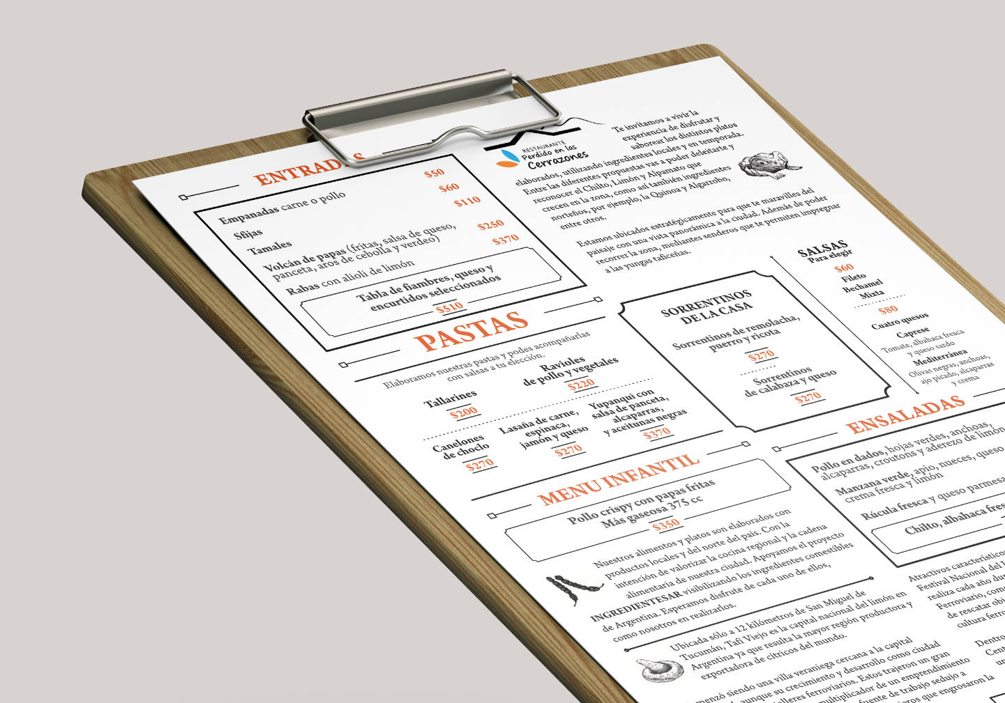
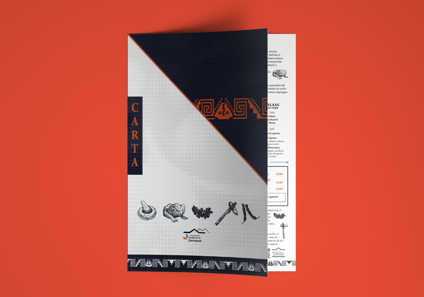
With strong indigenous history in the region, this restaurant wanted a menu to reflect it. Taking inspiration from their in-house museum, we incorporated several illustrations. A bold three colour scheme was decided upon mixing navy blue, celeste and bright orange to give vibrance and authority to the design. Unusually the menu includes text that gives important historical references to the location and its culture. They pride themselves on using local produce as much as possible and we did everything to embrace this.
ClientPerdido en las CerrazonesCountryArgentinaServicesBranding, Menu Design